

KFC, UAE
Creating a meal customization experience

Period: 2020
Industry: food-tech, e-commerce
ROLE: UI, UX, Interaction design
Platforms: Web, Mobile
RESEARCH & DISCOVERY
Change statement:
For KFC customers, how might we offer the best possible user experience so that we increase engagement, and retention and ultimately drive revenue.
REDESIGN THEMES
1. Efficiency
How to make the pre-checkout journey fast and easy to go through.
↓
2. Acquisition
How to make it easy for customers to discover, understand, and order the right product from the KFC website.
↓
3. Retention
How to convert new customers into returning ones and ensure their long-term brand loyalty.
SUCCESS METRICS
Efficiency
Make the pre-checkout journey, fast and easy to go through
📉 Time in customization flows
📉 Time to choose meals
📉 Inaccurate orders
Acquisition
Make it easy for customers to discover, understand and order the right product
📉 Call center ordering
📉 Ordering percentage through aggregators like Zomato, Uber Eats, etc.
📉 Bounce rate / exit rate
📈 Website conversion rate
📈 Revenue from new sale
WHO IS THE CUSTOMER?
Based on KFC'S UAE Google Analytics:
- 54% of the users are between 25-34 years old
- 55% are located in Dubai
- 69% were new users vs. returning users (~230K avg. monthly users)
- 73% used their mobile phone to access the website
- 87% used English website version vs. Arabic
- 60% were Male vs. Female

KFC WEBSITE USER JOURNEY
The end-to-end guest user journey consists of 14 steps and 13 steps for the logged-in user.
It potentially can be simplified to 6 and 5 steps respectively.
Exploration and Customization were the parts of the user journey I was designing for.
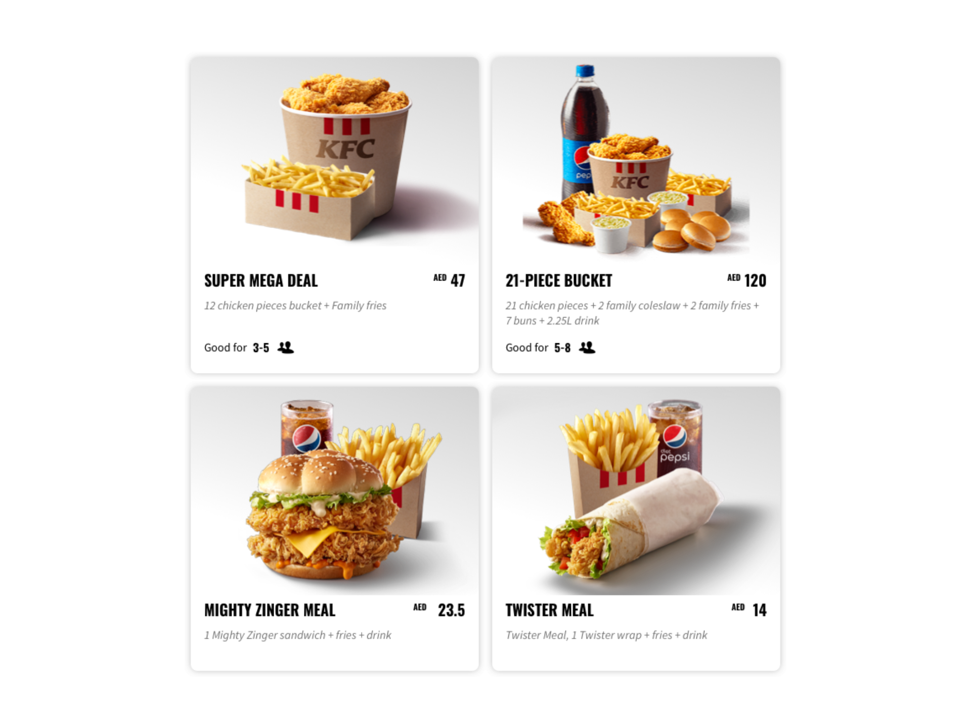
TOP SELLING MEALS AND WHO ORDERS IT
I chose to focus on large groups and families in our research as people usually order KFC as some kind of ritual when they meet with friends to share food and enjoy quality time together.
Also, discovered that 4 unique meals that are large “for sharing” meals that serve 3+ people are making over 50% of the total website revenue.
PROJECT DISCOVERY KEY ACTIVITIES
Data Analysis
Expert Review
Design Ideation
Customers Interviews
Field Research
Competitors Analysis
Data Analysis
We analyzed who visits KFC website, their behavior and how the website performs.
Expert Review
The review of the pages that are the part of the selected user flow helped to define pain points and prepare user interview scripts.
Design Ideation
We ideated on possible design direction and some ideas on how to improve product exploration, selection, and customization flow.
Customers Interviews
We interviewed 10 KFC website, regular users to understand their behavior and motivations better.
Field Research
The team visited one of the KFC's restaurants to observe how customers make their choice, order food, and some of the restaurant's operations.
Competitors Analysis
We made a research on direct and indirect competitors on how they solve similar problems.
KEY INSIGHTS FROM USER INTERVIEWS AND FIELD RESEARCH
🍗 Users order via aggregators such as Zomato, Talabat more often than through the website
🍗 Users don't always understand which deals or value website offers compared to the aggregators
🍗 10 out of 10 users were confused about product naming and labeling
🍗 Special requests, like removing tomatoes, that are coming from the call centers are not directly displayed on the restaurant's kitchen terminal
🍗 4 out of 10 users were conscious about their health
🍗 6 out of 10 users highlighted that images were the most important information that helped them identify and choose the product
🍗 Users experienced difficulties with product customization
🍗 Customers frequently ask to remove tomato, salt, lettuce, sauces, or cheese from their order
🍗 Customers don't usually expect the restaurant charges an additional price for extra dips and sauces
Prototype
I have created several responsive prototypes for the most popular KFC meals that generate over 50% of the total website revenue.
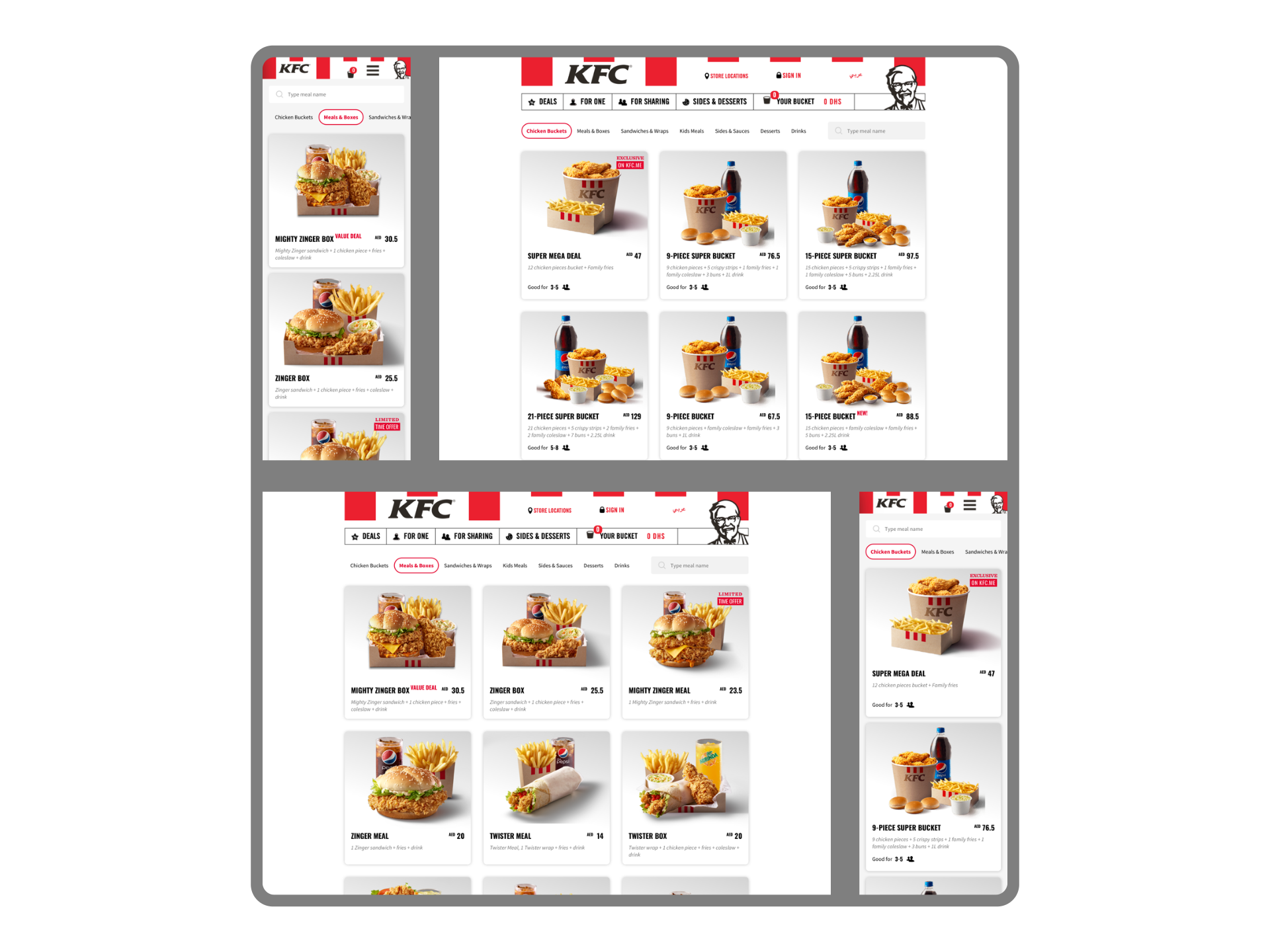
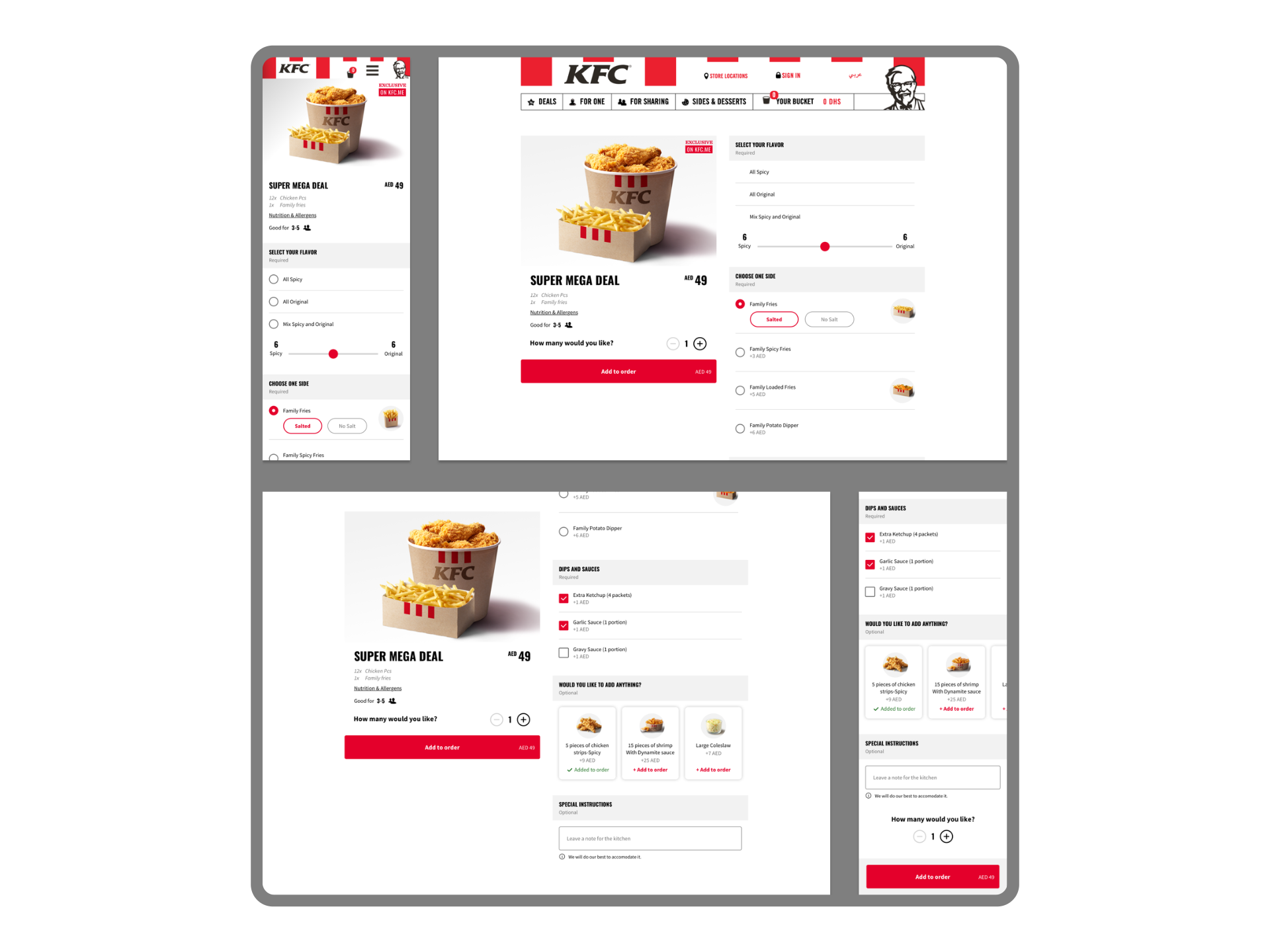
SUPER MEGA DEAL
The prototype was designed to test the findability and customization of the Super Mega Deal product.
9 of 10 participants were able to customize their order fast and easily, adding, removing ingredients and modifying the quantity.
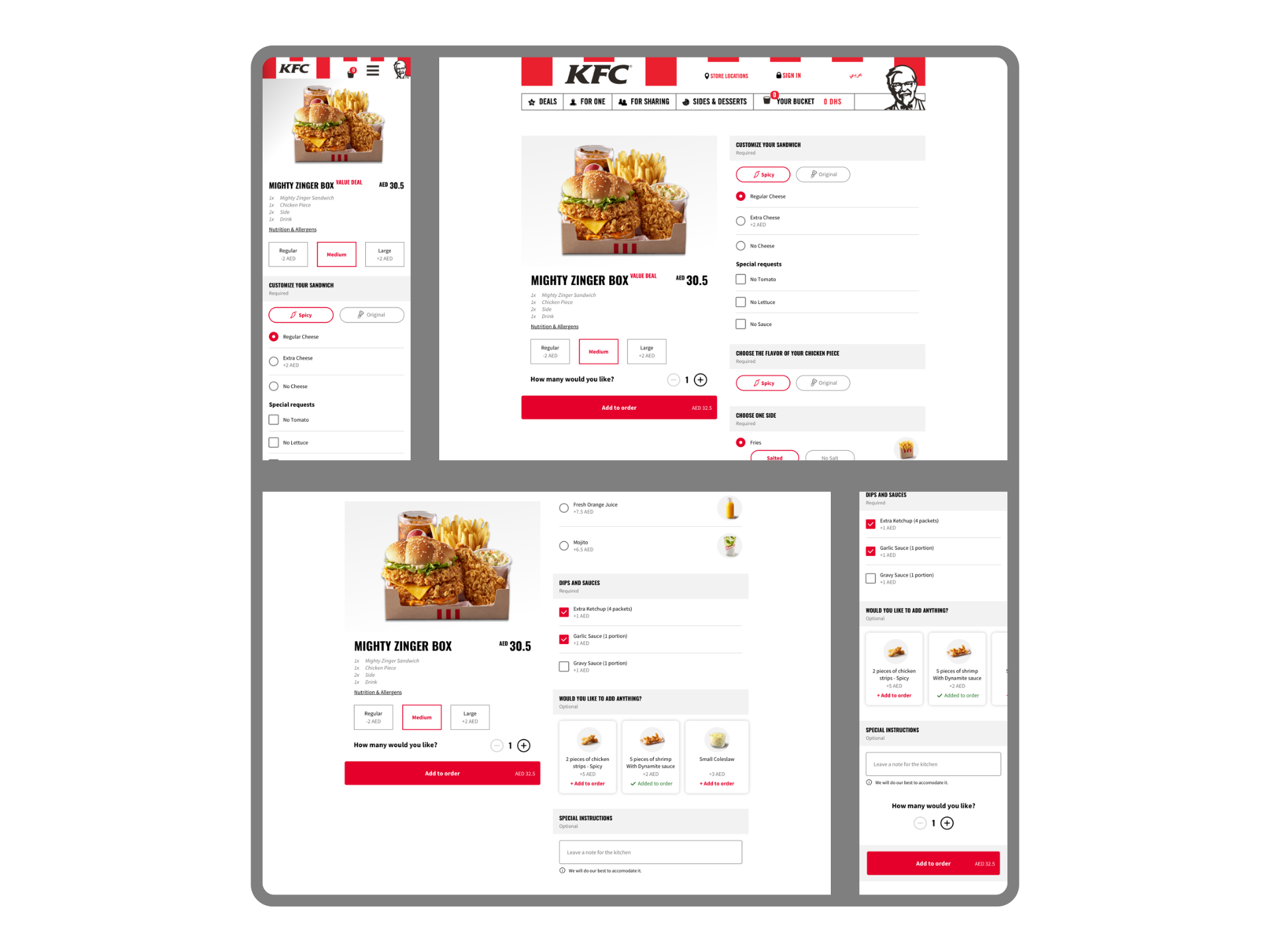
MIGHTY ZINGER SANDWICH
The participants of the testing could easily find the upgrading and up-selling components to change their meals.
New elements like adding or removing salt and ice tested very well. It gave the users flexibility that has been missed before. The interaction was intuitive and easy to use.
MIGHTY ZINGER BOX
The newly introduced add-ons component tested successfully and gave the users an additional value and flexibility in adding extra addons for a cheaper price to their order.
On top of that, participants were excited by large rich images of the drinks, sides, and addons that gave them information about the product without reading the text description.
Key results
+28%
1:48
+16%
-5%
-9%
Growth in revenue
Average time spent for meal customization
Website conversion growth
Bounce rate / exit rate
Call center ordering
Need a consultation?
Whatsapp: +971 58 682 3763
Telegram: @mxplvd
Teel
Email: plvd.design@gmail.com
© plvd.design 2026
All rights reserved.
Follow me on: